
Threads
The thread parts pick, start and delete threads. They show the end user’s threads, which Super Assist keeps, most recently active first. New thread, rename and delete go to Super Assist.
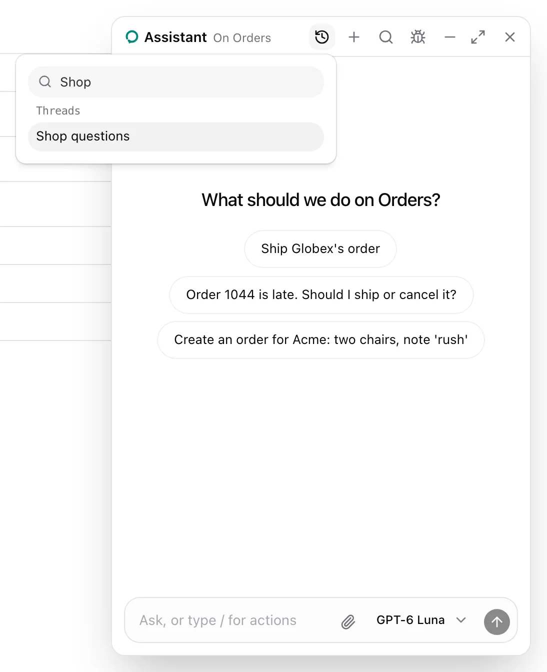
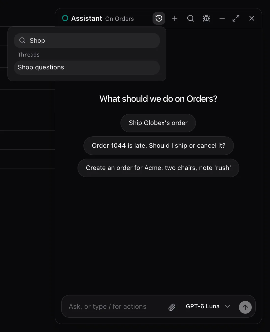
Set threads on the root and the default header places the parts for that style:
<AssistedPanel mode="floating" threads="drawer" />Or place them yourself. This header opens a drawer and starts a thread, with the host’s own buttons:
<AssistedPanel.Floating launcher={false}> <AssistedPanel.Main> <AssistedPanel.Header> <AssistedPanel.ThreadDrawerToggle asChild> <IconButton icon={PanelLeft} /> </AssistedPanel.ThreadDrawerToggle> <AssistedPanel.ThreadTitle /> <AssistedPanel.NewThread asChild> <IconButton icon={Plus} /> </AssistedPanel.NewThread> <AssistedPanel.Close /> </AssistedPanel.Header> <AssistedPanel.ThreadDrawer /> <AssistedPanel.Conversation /> <AssistedPanel.Composer /> </AssistedPanel.Main></AssistedPanel.Floating>ThreadDrawer overlays the conversation, so it sits in Main beside the other parts, not in the header.
For a panel wide enough to show the list all the time, Threads is a column before Main. The one-liner places it with threads="side", and leaves the thread parts out of the header:
<AssistedPanel.Embedded threads="side" />Or place ThreadList in your layout, here beside an embedded panel. From examples/app/app/assistant.tsx:
import { AssistedPanel, ThreadList } from "@super-assist/react";
<div className="flex h-dvh">  <aside className="w-64 shrink-0 border-e p-2">    <ThreadList />  </aside>  <main className="min-w-0 flex-1 overflow-y-auto p-6">{children}</main>  <div className="w-md shrink-0 border-s">    <AssistedPanel mode="embedded" />  </div></div>;
What the model sees
Section titled “What the model sees”Nothing. Each part switches threads through the runtime.
| Part | Kind | Renders |
|---|---|---|
AssistedPanel.Threads |
Row | The thread list in a 256 px column before Main, with its New Thread button and search. |
AssistedPanel.ThreadMenu |
Leaf | A History button that opens a popover with a search over the threads and their previews. |
AssistedPanel.ThreadSelect |
Row | A row with a native select over the threads, NewThread and DeleteThread. |
AssistedPanel.ThreadDrawerToggle |
Leaf | Opens and closes the drawer. |
AssistedPanel.ThreadDrawer |
Row | The thread list in a 256 px column over the conversation. Picking a thread or the backdrop closes it. |
AssistedPanel.ThreadTitle |
Text | The open thread’s title, or “New thread”. |
AssistedPanel.NewThread |
Leaf | Starts a new thread. |
AssistedPanel.DeleteThread |
Leaf | Deletes the open thread after a dialog asks. Disabled for a thread the runtime has not listed yet. |
Picker styles
Section titled “Picker styles”threads |
The default composition places |
|---|---|
true or "menu" |
ThreadMenu and NewThread in the header. |
"select" |
ThreadSelect in a row under the header. |
"drawer" |
ThreadDrawerToggle and ThreadTitle in place of the icon and title, NewThread, and ThreadDrawer. |
"side" |
Threads before Main, and nothing in the header. |
The menu’s search reads each thread’s title, and its custom.group and custom.preview when the runtime gives them. Threads without a title read “New thread” in the menu and “Untitled” in the select.
| Part | Props |
|---|---|
ThreadMenu, ThreadDrawerToggle, NewThread, DeleteThread |
A button’s props and asChild |
Threads, ThreadSelect, ThreadDrawer, ThreadTitle |
className |
ThreadList, the list Threads and the drawer show, is exported on its own for a list in your layout.
See also
Section titled “See also”- Use the hosted runtime, so a user’s threads follow them across browsers.
- Header for where the default places them.