
Table card
The table card lays out records of one kind: rows of the same shape, with the fields they share as columns. The assistant shows it with show_table when the user asks to see data laid out.
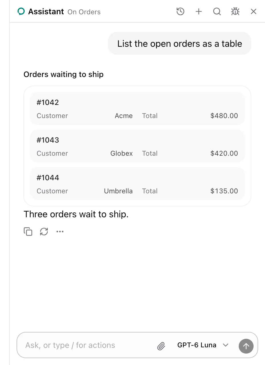
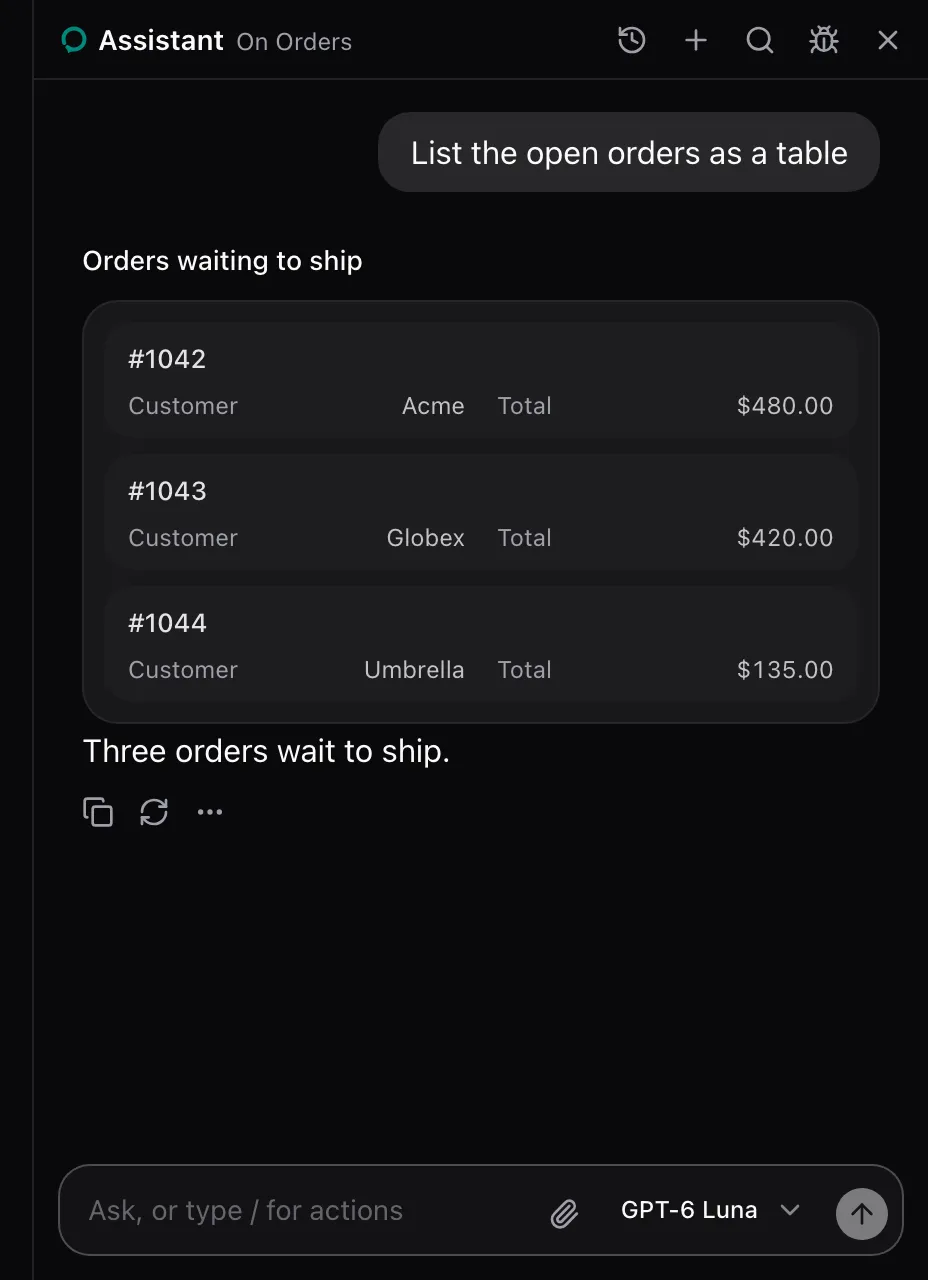
AssistedProvider lends show_table on every page. There is nothing to set up. See Show a table, a spec or a comparison.
What the model sees
Section titled “What the model sees”show_table is described as:
Show the user a table: records of the same kind as rows, the fields they share as columns. For structured answers the user can scan, like a list of orders.| Parameter | Type | Required |
|---|---|---|
title |
string |
No |
columns |
One or more of { key: string; label: string } |
Yes |
rows |
Record<string, string | number | boolean | null>[], each a row’s values by column key |
Yes |
The call answers Showed the user a table. It changes nothing on the page.
None. The package renders it in place of the show_table call: the title, then the table with the title as its caption. Replace it with cards.table on AssistedProvider, see Swap a card. The card carries data-slot="assisted-table".
See also
Section titled “See also”- Spec card for one thing’s properties.
- Comparison card for two or three options side by side.