
Roots and window
AssistedPanel shows the assistant’s conversation beside the page: a floating window, a sheet that takes its space from the page, or embedded where the host places it. Each mode is a root part. The roots hold the window, and every other part renders inside one, in a row of two columns: Threads, when the panel shows the thread list beside the conversation, and Main, which holds the rest.
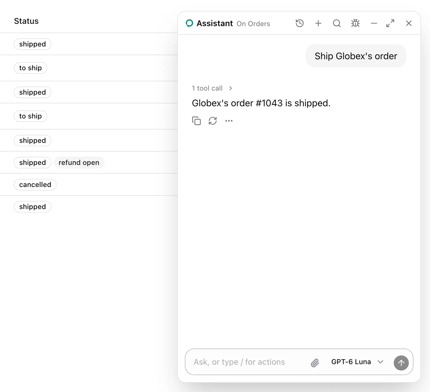
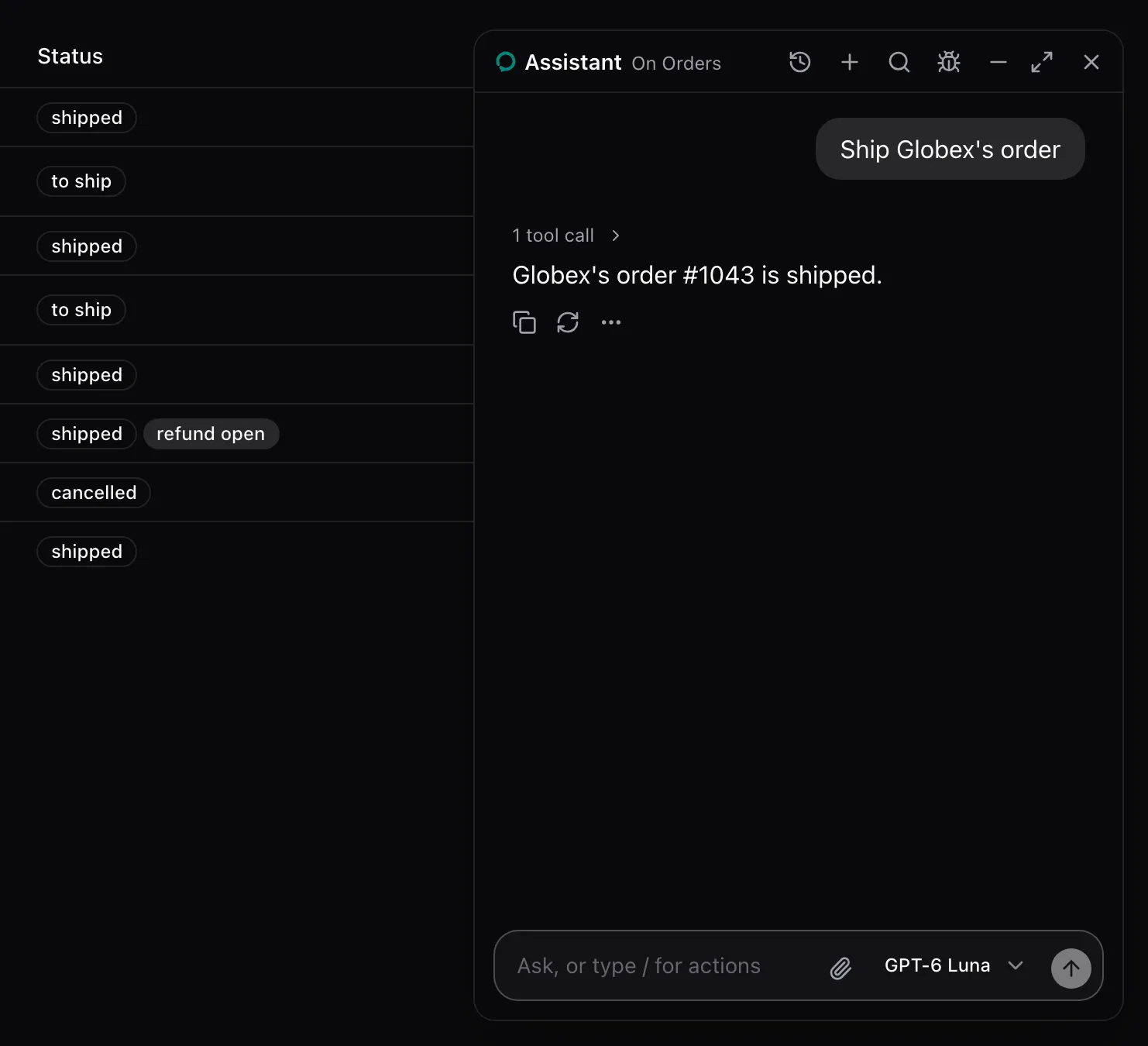
The one-liner picks a root by mode and renders its default composition. From examples/app/app/assistant.tsx, with the example’s props:
<AssistedPanel mode="floating" threads models={models} devtools={<AssistedDevtoolsPanel />} />The roots take the same props as members of AssistedPanel. With children, a root renders exactly those, and Main is the column the header, the conversation and the composer go in:
<AssistedPanel.Floating defaultPosition="bottom-left"> <AssistedPanel.Main> <AssistedPanel.Header /> <AssistedPanel.Conversation /> <AssistedPanel.Composer /> </AssistedPanel.Main></AssistedPanel.Floating>What the model sees
Section titled “What the model sees”Nothing from the roots. They render the runtime’s thread, and the header reads the open page’s name from useAssisted().
| Part | Kind | Renders |
|---|---|---|
AssistedPanel |
One-liner | Floating, Sheet or Embedded by mode, with the root’s default composition. |
AssistedPanel.Floating |
Root | A window portaled at z-index 50, dragged by its header and resized at its edges. Escape closes it. |
AssistedPanel.Sheet |
Root | An aside, w-md wide, that takes its space from the page, with no overlay. |
AssistedPanel.Embedded |
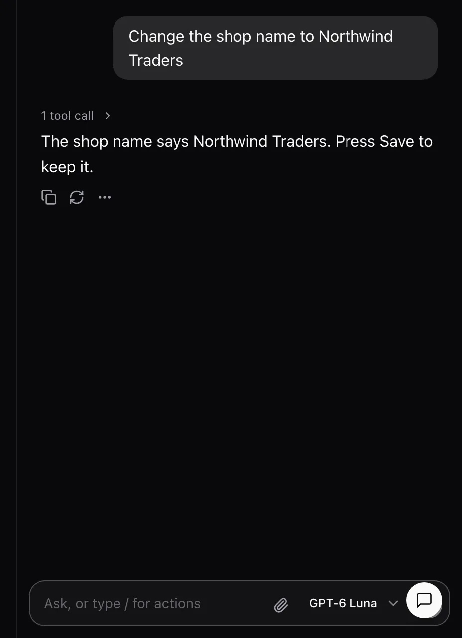
Root | The conversation where the host places it. It is always shown and has no launcher. |
AssistedPanel.Main |
Container | The column beside Threads that holds the header, the conversation, the composer and the footer. |
AssistedPanel.Launcher |
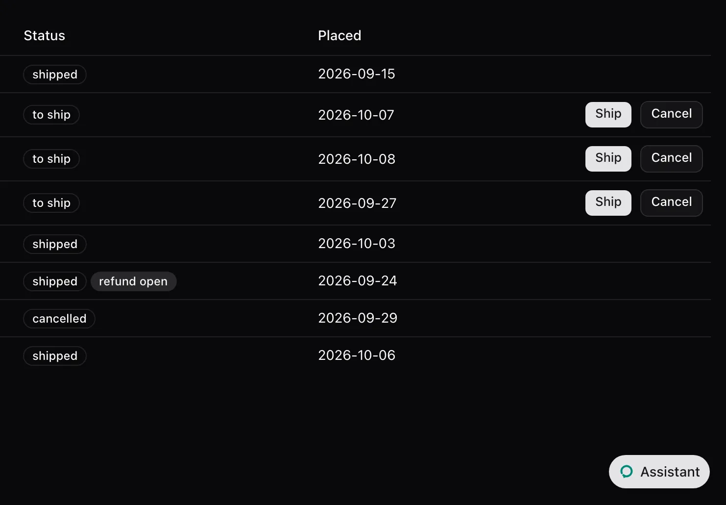
Leaf | Opens a closed panel. Floating: a rounded button at the bottom corner. Sheet: a 48 px rail with a button. |
AssistedPanel.Trigger |
Leaf | A small “Assistant” button for the host’s own toolbar. It opens and closes the panel. |
AssistedPanel.WindowControls |
Leaf | Minimize, Maximize and Restore. Floating only, nothing in the other modes. |
Default composition
Section titled “Default composition”| Part | No children |
|---|---|
| Any root | Threads when threads="side", then Main. Floating and Sheet render the Launcher while closed. |
Main |
Header except in Embedded, ThreadSelect when threads="select", Conversation, Composer, ThreadDrawer when threads="drawer". |
Floating and Sheet render the Launcher beside their children unless launcher is false.
States
Section titled “States”Floating, closed
Section titled “Floating, closed”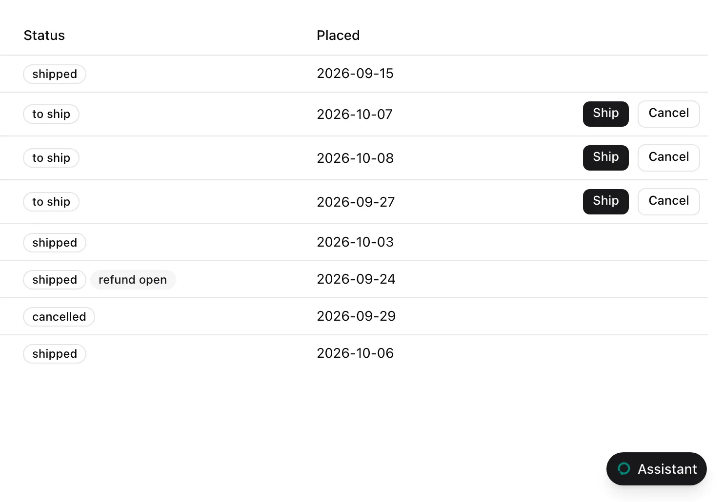
Floating, minimized
Section titled “Floating, minimized”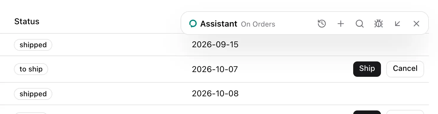
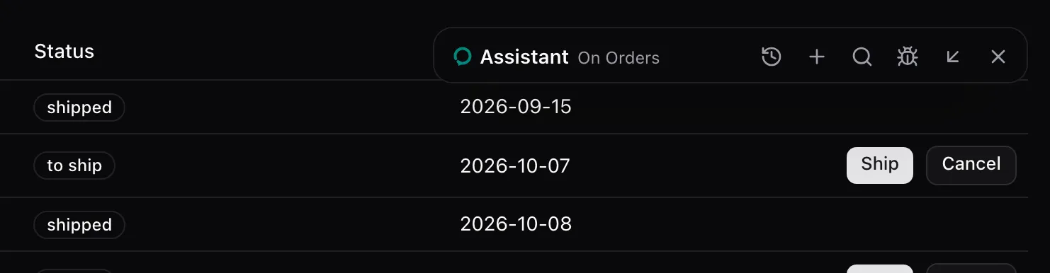
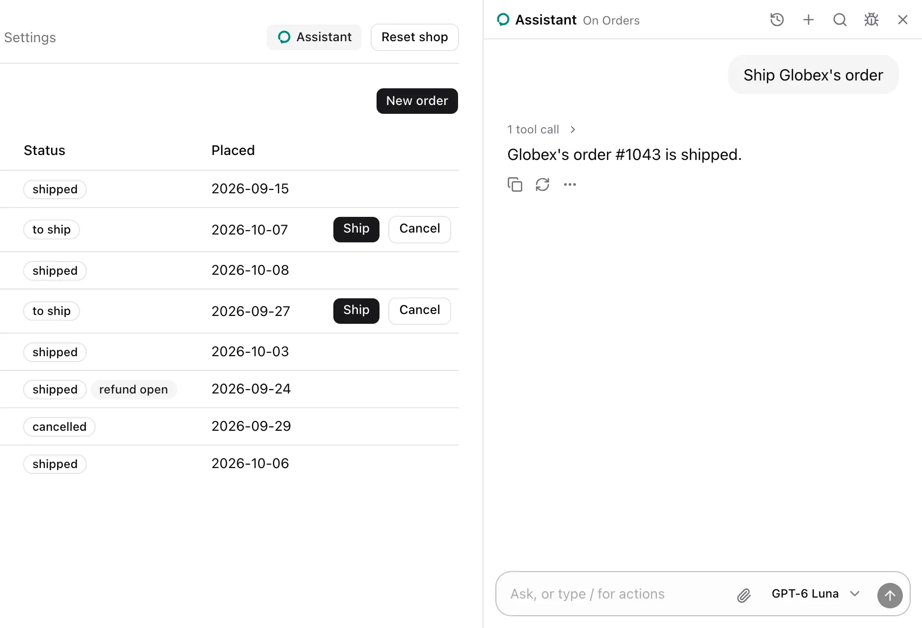
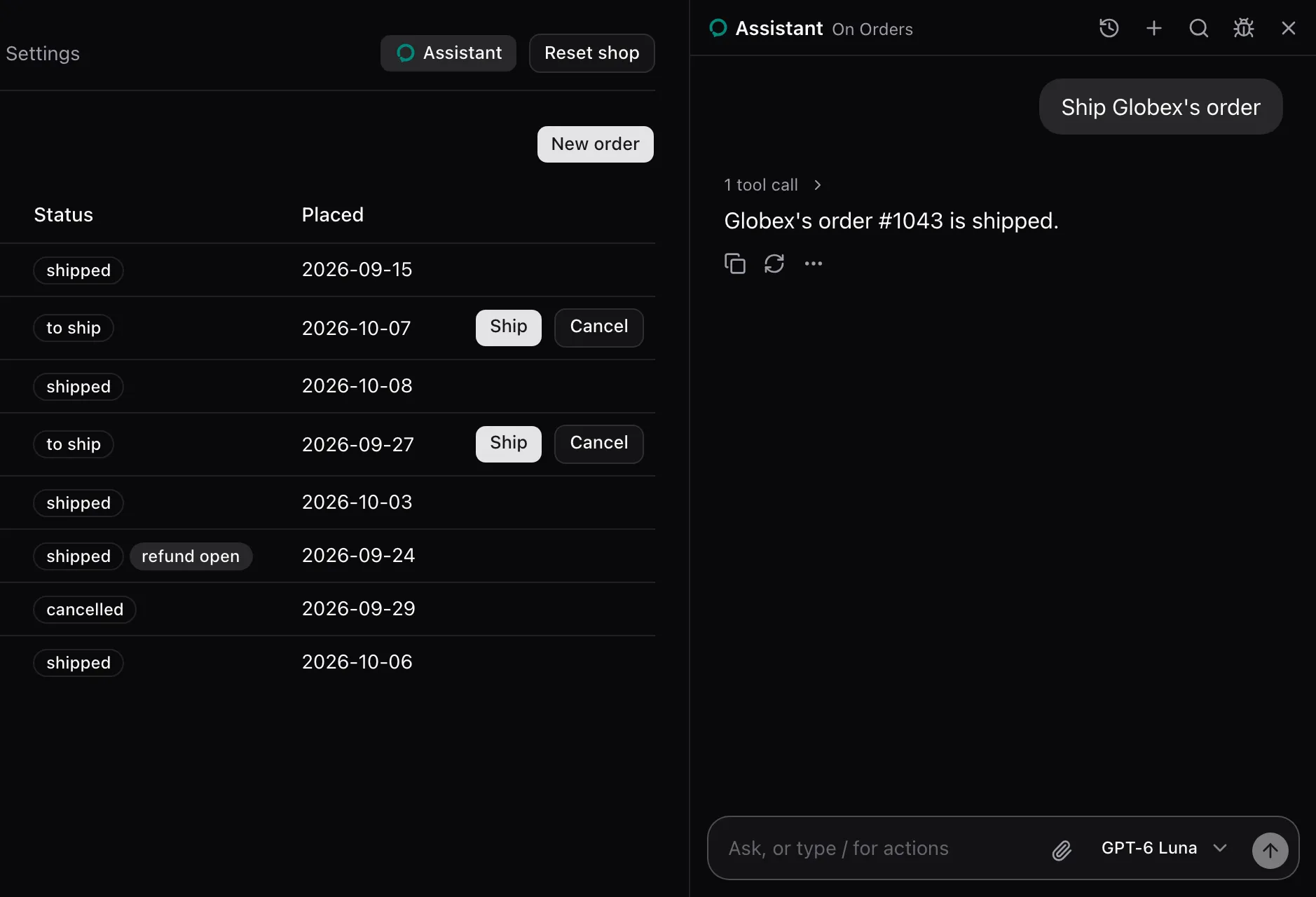
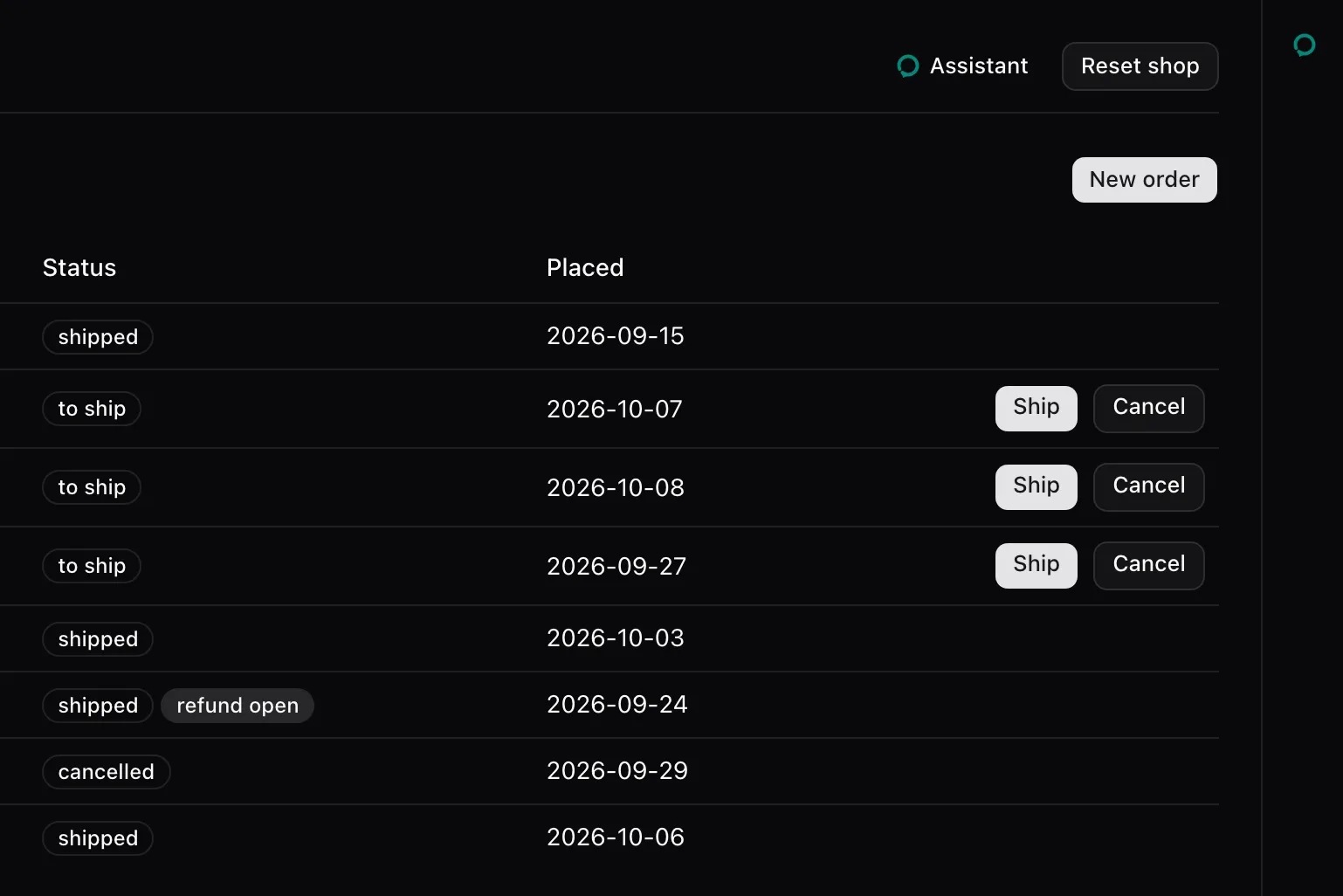
Sheet, closed
Section titled “Sheet, closed”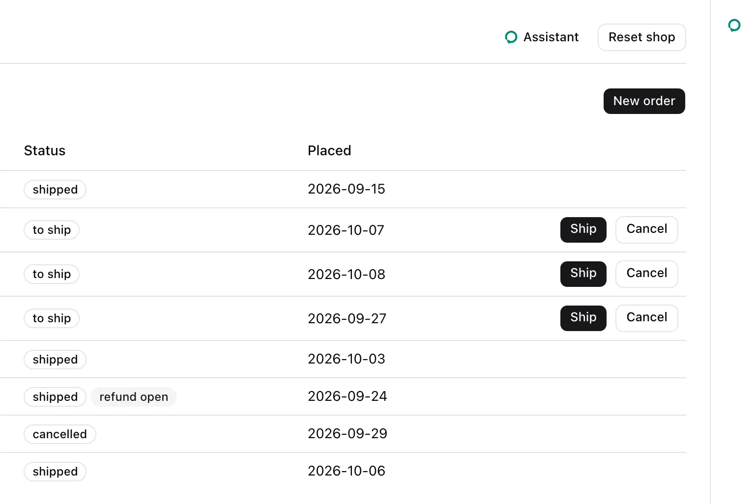
Embedded
Section titled “Embedded”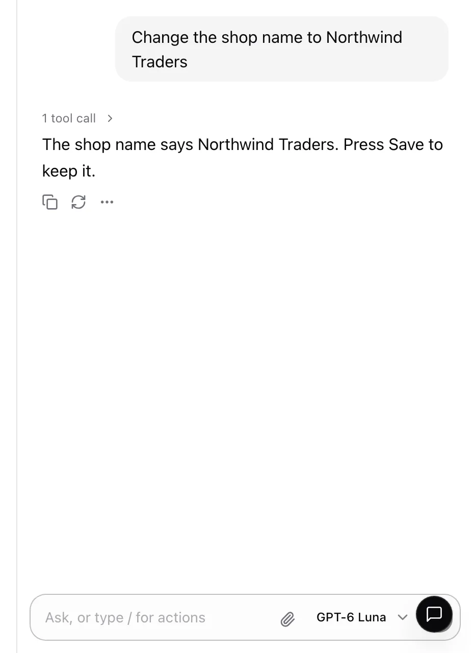
Trigger
Section titled “Trigger”

While the panel is open, the trigger is filled:


Root props
Section titled “Root props”Floating, Sheet, Embedded and the one-liner take these. Embedded takes every one but launcher.
| Prop | Type | Description |
|---|---|---|
threads |
boolean | "select" | "menu" | "drawer" | "side" |
The thread picker’s style, true meaning "menu". Off by default. See Threads. |
models |
readonly ModelOption[] |
The models the composer’s ModelSelector offers. The data parts need them. |
defaultModel |
string |
The id of the model picked at first. The first of models without one. |
title |
ReactNode |
The header’s name and the launcher’s label. “Assistant” by default. |
icon |
ReactNode |
Shown before the title and on the launcher. The assistant’s logo by default. |
description |
string |
The header’s line when no assisted page is open. |
devtools |
ReactNode |
What the header’s Bug button opens, usually <AssistedDevtoolsPanel />. No button without it. |
launcher |
boolean |
false leaves the launcher out, for a panel opened only by a Trigger or useAssisted().open. |
className |
string |
Classes for the root’s outer element. |
children |
ReactNode |
The parts to render in place of the default composition. |
The one-liner adds mode, "floating" | "sheet" | "embedded", required.
Window props
Section titled “Window props”Floating and the one-liner in floating mode take these too.
| Prop | Type | Description |
|---|---|---|
defaultPosition |
"bottom-right" | "bottom-left" | "top-right" | "top-left" |
The corner it first opens in, 24 px in, and the launcher’s side. "bottom-right" by default. |
defaultSize |
{ width: number; height: number } |
Its first size, cut to the viewport less 24 px. 420 by 640 px by default. At least 320 by 360 px. |
resizable |
boolean |
Resized at its edges and corners. On by default. |
draggable |
boolean |
Dragged by its header. On by default. |
windowControls |
boolean |
The Minimize, Maximize and Restore buttons, and maximizing on a double-click of the header. On by default. |
The position and size persist across opens.
Leaf props
Section titled “Leaf props”Launcher and Trigger take a button’s props and asChild. With asChild, the part renders your element in place of its button and keeps its behavior:
<AssistedPanel.Trigger asChild> <Button>Help</Button></AssistedPanel.Trigger>Launcher renders nothing while the panel is open. Trigger sets aria-pressed while it is open. WindowControls takes className.
Types: AssistedPanelProps, AssistedPanelFloatingProps, AssistedPanelSheetProps, AssistedPanelEmbeddedProps, AssistedPanelOptions (the root props) and AssistedPanelWindowProps.
- Render the roots inside
AssistedProvider. Floating and sheet read and setuseAssisted()’sisOpen. - Every root carries
data-super-assist, which scopes the styles.
See also
Section titled “See also”- Place the panel picks a mode and opens it from your chrome.
- Rearrange the panel’s parts composes the roots by hand.
- Parts and the default composition explains the model.