
AssistedProvider
AssistedProvider lends what every page shares: the universal instructions, offer_choices, the show tools show_table, show_spec and show_comparison, and go_to_page and show_links when it has destinations. It holds the cards those tools render. useAssisted reads and drives the panel’s open state.
Give it the runtime from useAssistedRuntime and wrap the app. From examples/app/app/assistant.tsx:
const runtime = useAssistedRuntime({  key: process.env.NEXT_PUBLIC_SUPER_ASSIST_KEY!,  host: process.env.NEXT_PUBLIC_SUPER_ASSIST_HOST,});
<AssistedProvider  runtime={runtime}  destinations={destinations}  starters={["What can you do on this page?"]}  navigate={(path) => router.push(withMode(path))}>  <Layout>{children}</Layout></AssistedProvider>;
destinations names the pages go_to_page opens. From the same file:
const destinations = { home: "/", orders: "/orders", order: "/orders/:id", customers: "/customers", settings: "/settings",};What the model sees
Section titled “What the model sees”Every request’s system text holds the universal instructions, quoted in Model context. With the example’s destinations, go_to_page is described as:
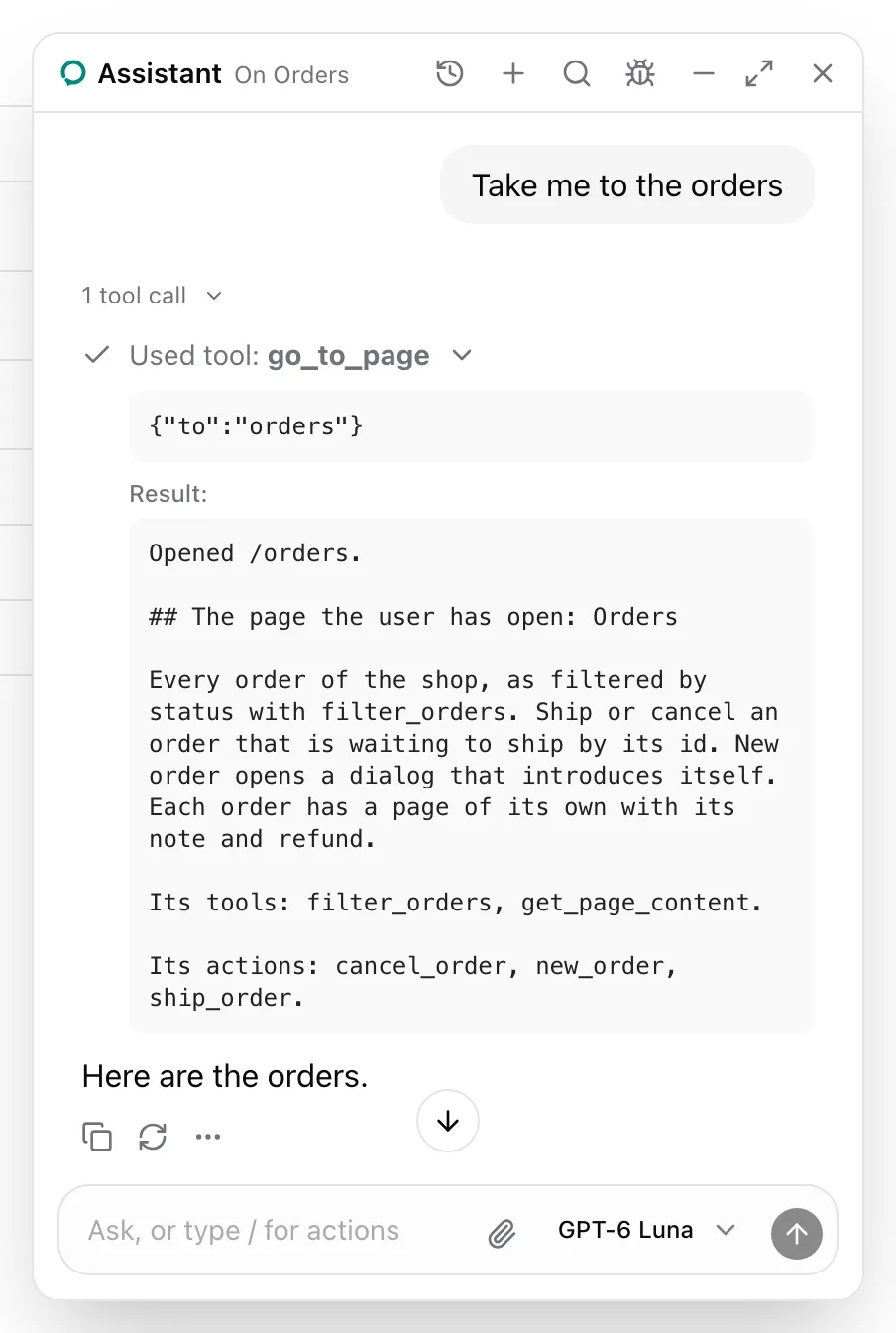
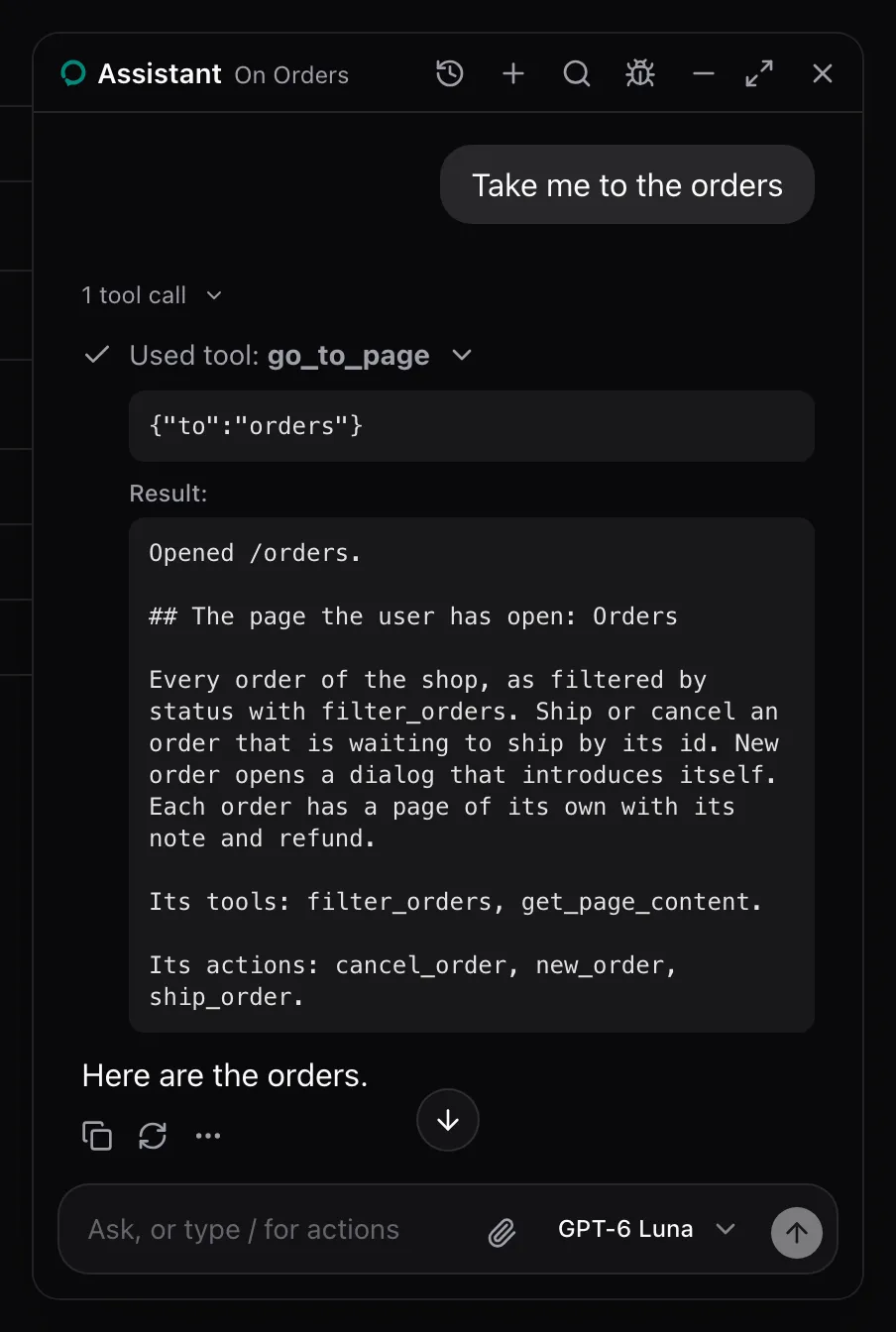
Open a page of the app for the user and answer, once it has loaded, with the page section of the page it opened. The pages and their paths: home /, orders /orders, order /orders/:id, customers /customers, settings /settings.The call in the screenshot answered with the path it opened and the note of the page there:
Opened /orders.
## The page the user has open: Orders
Every order of the shop, as filtered by status with filter_orders, and charted by status with chart_orders. Ship or cancel an order that is waiting to ship by its id. New order opens a dialog that introduces itself. Each order has a page of its own with its note and refund.
Its tools: filter_orders, chart_orders, get_page_content.
Its actions: cancel_order, new_order, ship_order.show_links, offer_choices and the show tools render cards, each on its own page under Cards.
| Prop | Type | Required | Description |
|---|---|---|---|
runtime |
AssistantRuntime |
Yes | The runtime from useAssistedRuntime. |
destinations |
Record<string, string> |
No | Page names to paths. :id in a path takes an id. |
destinationsDescription |
string |
No | Replaces the pages and their paths in go_to_page’s description. |
navigate |
(path: string) => unknown |
No | Opens a path. go_to_page awaits it. |
starters |
string[] |
No | First messages the empty state suggests on a page without its own. |
cards |
AssistedCards |
No | Cards that replace the package’s, by tool. See below. |
trace |
boolean |
No | Shows every press and fill on the page with a ring. Off by default. |
children |
ReactNode |
Yes | The app. |
- Renders
AssistantRuntimeProviderwithruntime. - Lends the universal instructions,
offer_choices,show_table,show_specandshow_comparison. - Lends
go_to_pageandshow_linksonly when bothdestinationsandnavigateare given. - Renders the agent’s
search_knowledgecalls as the sources card under the answer, without lending a tool. - Answers calls to tools and actions that have left with
{ error }and the open page’s note. - Stamps each user message with the id of the tab that sent it, in
metadata.custom.tab, and runs a call only in that tab. Other tabs wait for its result. - Holds the panel’s open state, closed at first.
- With
trace, a press or fill flashes a ring on its element for a second, and a"confirm"action keeps the ring on its element while the panel asks. An action or field sets its owntraceto differ. AssistedPage,AssistedAction,AssistedInput,AssistedField,useAssistedTool,useAssisted, the panel and the devtools render inside it.
AssistedCards
Section titled “AssistedCards”cards maps a card to the component that replaces it. Each is optional, and each takes the default card’s props: the tool call’s args, result, isError, and while it waits, interrupt and resume.
| Key | Replaces | args |
|---|---|---|
confirm |
The confirm card of every consequential action and tool | Any. interrupt.payload is { name, label, id? }. |
choices |
The choices card | { question, options } |
links |
The links card | { items } |
table |
The table card | { title?, columns, rows } |
spec |
The spec card | { title, rows } |
comparison |
The comparison card | { traits, options, recommended, reason } |
sources |
The sources card under an answer | { query, knowledgeBase? } |
A confirm card answers with resume({ approved: boolean }), and a choices card with resume(option).
useAssisted
Section titled “useAssisted”useAssisted(): { isOpen: boolean; open: (message?: string) => void; close: () => void; page: string | undefined;}| Field | Description |
|---|---|
isOpen |
Whether the floating or sheet panel is open. |
open(message?) |
Opens the panel. With a message, appends it to the thread as the user’s. |
close() |
Closes the panel. |
page |
The open assisted page’s name, or undefined. |
Throws Render this inside an AssistedProvider outside the provider. The panel’s header reads page, and AssistedPanel.Trigger toggles isOpen.
See also
Section titled “See also”- Use the hosted runtime for the options of the runtime it takes.
- Swap a card sets
cards. - Add
go_to_pagesetsdestinationsandnavigate. - How model context composes explains what it lends and when.