# Roots and window
> AssistedPanel and its roots Floating, Sheet and Embedded, the Main column, the Launcher that opens a closed panel, the host-placed Trigger and the window controls.
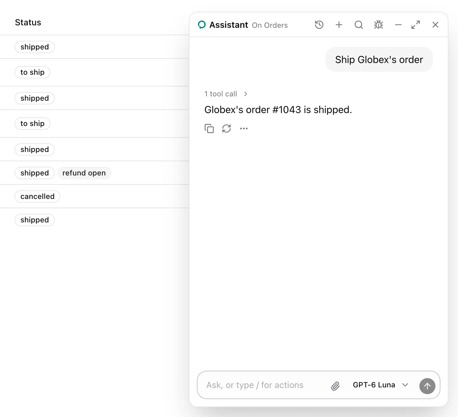
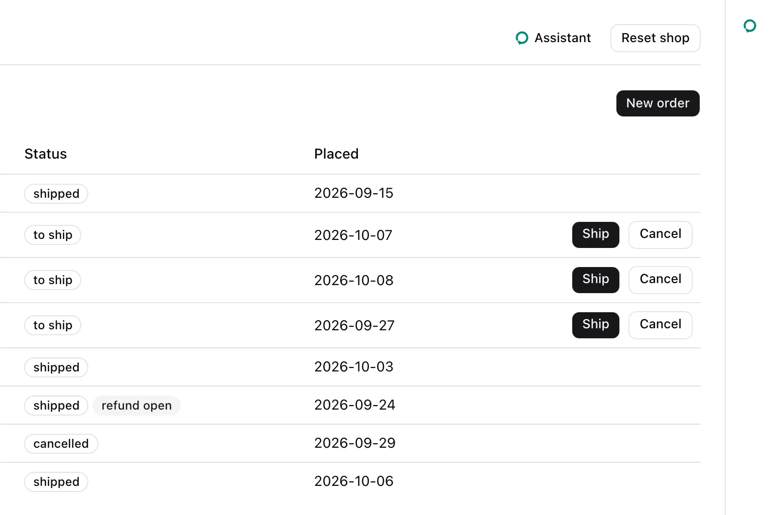
`AssistedPanel` shows the assistant's conversation beside the page: a floating window, a sheet that takes its space from the page, or embedded where the host places it. Each mode is a root part. The roots hold the window, and every other part renders inside one, in a row of two columns: `Threads`, when the panel shows the thread list beside the conversation, and `Main`, which holds the rest.
## Usage
The one-liner picks a root by `mode` and renders its default composition. From `examples/app/app/assistant.tsx`, with the example's props:
```tsx
} />
```
The roots take the same props as members of `AssistedPanel`. With children, a root renders exactly those, and `Main` is the column the header, the conversation and the composer go in:
```tsx
```
## What the model sees
Nothing from the roots. They render the runtime's thread, and the header reads the open page's name from `useAssisted()`.
## Parts
| Part | Kind | Renders |
| ------------------------------ | --------- | --------------------------------------------------------------------------------------------------------- |
| `AssistedPanel` | One-liner | `Floating`, `Sheet` or `Embedded` by `mode`, with the root's default composition. |
| `AssistedPanel.Floating` | Root | A window portaled at z-index 50, dragged by its header and resized at its edges. Escape closes it. |
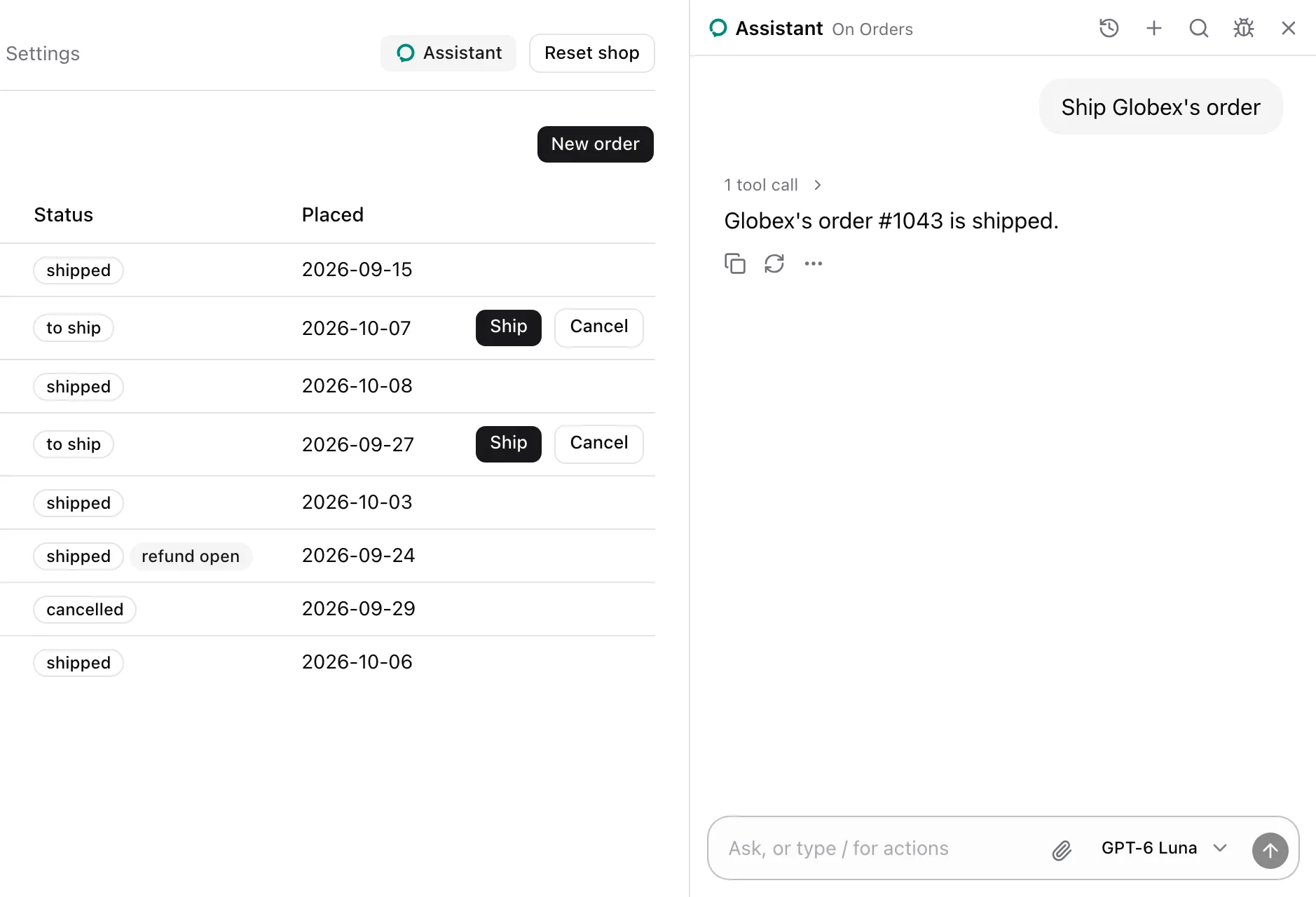
| `AssistedPanel.Sheet` | Root | An `aside`, `w-md` wide, that takes its space from the page, with no overlay. |
| `AssistedPanel.Embedded` | Root | The conversation where the host places it. It is always shown and has no launcher. |
| `AssistedPanel.Main` | Container | The column beside `Threads` that holds the header, the conversation, the composer and the footer. |
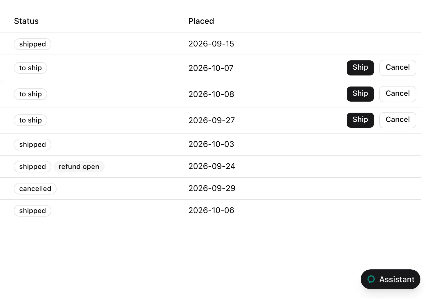
| `AssistedPanel.Launcher` | Leaf | Opens a closed panel. Floating: a rounded button at the bottom corner. Sheet: a 48 px rail with a button. |
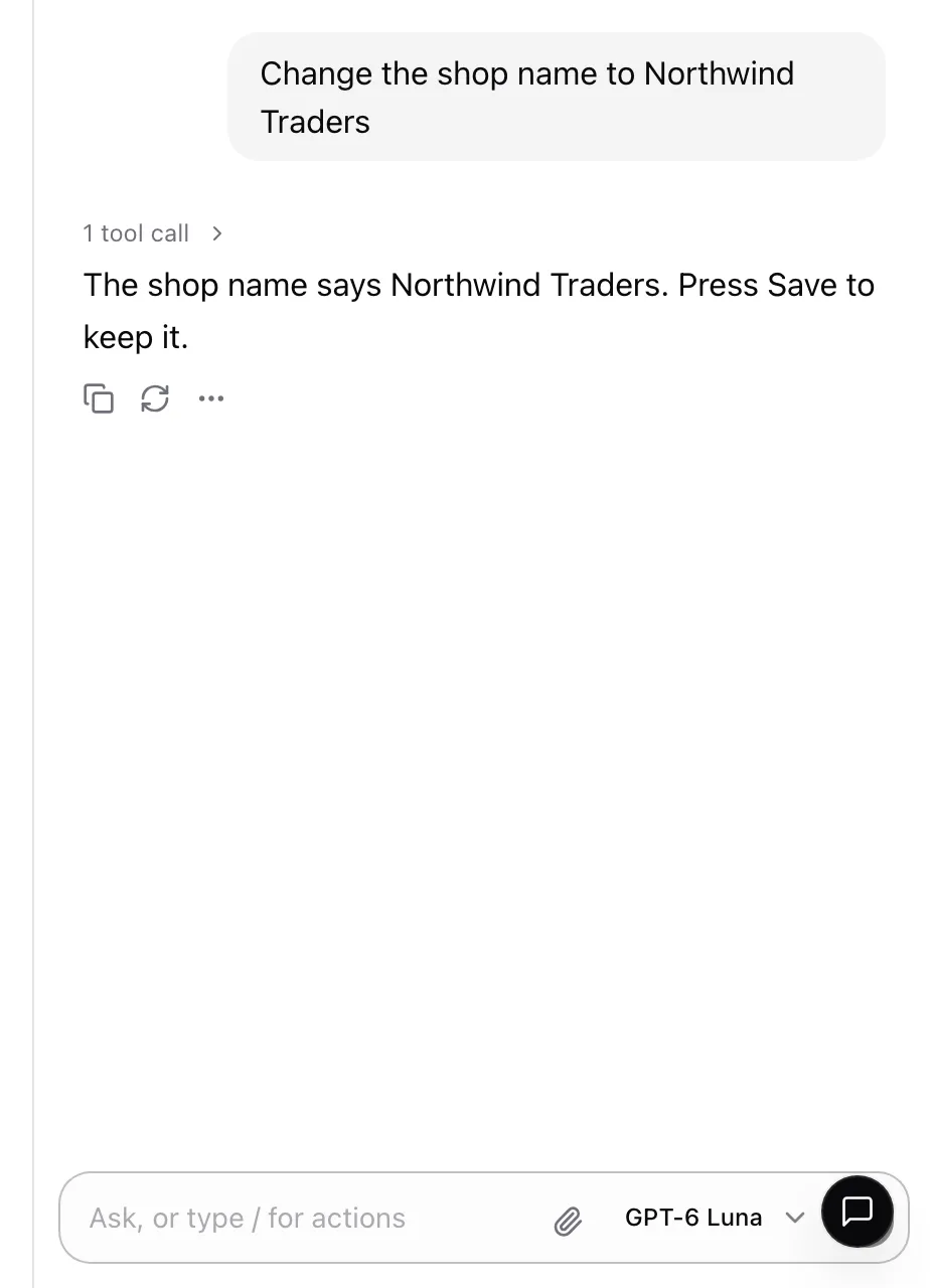
| `AssistedPanel.Trigger` | Leaf | A small "Assistant" button for the host's own toolbar. It opens and closes the panel. |
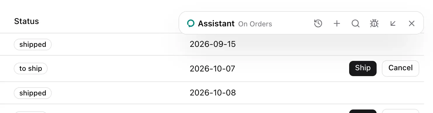
| `AssistedPanel.WindowControls` | Leaf | Minimize, Maximize and Restore. Floating only, nothing in the other modes. |
### Default composition
| Part | No children |
| -------- | ------------------------------------------------------------------------------------------------------------------------------------------ |
| Any root | `Threads` when `threads="side"`, then `Main`. `Floating` and `Sheet` render the `Launcher` while closed. |
| `Main` | `Header` except in `Embedded`, `ThreadSelect` when `threads="select"`, `Conversation`, `Composer`, `ThreadDrawer` when `threads="drawer"`. |
`Floating` and `Sheet` render the `Launcher` beside their children unless `launcher` is `false`.
## States
### Floating, closed
### Floating, minimized
### Sheet
### Sheet, closed
### Embedded
### Trigger

While the panel is open, the trigger is filled:

## Props
### Root props
`Floating`, `Sheet`, `Embedded` and the one-liner take these. `Embedded` takes every one but `launcher`.
| Prop | Type | Description |
| -------------- | ----------------------------------------------------- | ---------------------------------------------------------------------------------------------------------------------- |
| `threads` | `boolean \| "select" \| "menu" \| "drawer" \| "side"` | The thread picker's style, `true` meaning `"menu"`. Off by default. See [Threads](https://superassist.app/components/panel/threads.md). |
| `models` | `readonly ModelOption[]` | The models the composer's `ModelSelector` offers. The [data parts](https://superassist.app/components/panel/data-parts.md) need them. |
| `defaultModel` | `string` | The id of the model picked at first. The first of `models` without one. |
| `title` | `ReactNode` | The header's name and the launcher's label. "Assistant" by default. |
| `icon` | `ReactNode` | Shown before the title and on the launcher. The assistant's logo by default. |
| `description` | `string` | The header's line when no assisted page is open. |
| `devtools` | `ReactNode` | What the header's Bug button opens, usually [``](https://superassist.app/reference/devtools.md). No button without it. |
| `launcher` | `boolean` | `false` leaves the launcher out, for a panel opened only by a `Trigger` or `useAssisted().open`. |
| `className` | `string` | Classes for the root's outer element. |
| `children` | `ReactNode` | The parts to render in place of the default composition. |
The one-liner adds `mode`, `"floating" | "sheet" | "embedded"`, required.
### Window props
`Floating` and the one-liner in floating mode take these too.
| Prop | Type | Description |
| ----------------- | -------------------------------------------------------------- | ---------------------------------------------------------------------------------------------------------- |
| `defaultPosition` | `"bottom-right" \| "bottom-left" \| "top-right" \| "top-left"` | The corner it first opens in, 24 px in, and the launcher's side. `"bottom-right"` by default. |
| `defaultSize` | `{ width: number; height: number }` | Its first size, cut to the viewport less 24 px. 420 by 640 px by default. At least 320 by 360 px. |
| `resizable` | `boolean` | Resized at its edges and corners. On by default. |
| `draggable` | `boolean` | Dragged by its header. On by default. |
| `windowControls` | `boolean` | The Minimize, Maximize and Restore buttons, and maximizing on a double-click of the header. On by default. |
The position and size persist across opens.
### Leaf props
`Launcher` and `Trigger` take a button's props and `asChild`. With `asChild`, the part renders your element in place of its button and keeps its behavior:
```tsx
```
`Launcher` renders nothing while the panel is open. `Trigger` sets `aria-pressed` while it is open. `WindowControls` takes `className`.
Types: `AssistedPanelProps`, `AssistedPanelFloatingProps`, `AssistedPanelSheetProps`, `AssistedPanelEmbeddedProps`, `AssistedPanelOptions` (the root props) and `AssistedPanelWindowProps`.
- Render the roots inside `AssistedProvider`. Floating and sheet read and set `useAssisted()`'s `isOpen`.
- Every root carries `data-super-assist`, which scopes the [styles](https://superassist.app/reference/styles.md).
## See also
- [Place the panel](https://superassist.app/how-to/place-the-panel.md) picks a mode and opens it from your chrome.
- [Rearrange the panel's parts](https://superassist.app/how-to/rearrange-the-panel.md) composes the roots by hand.
- [Parts and the default composition](https://superassist.app/explanation/parts-and-the-default-composition.md) explains the model.